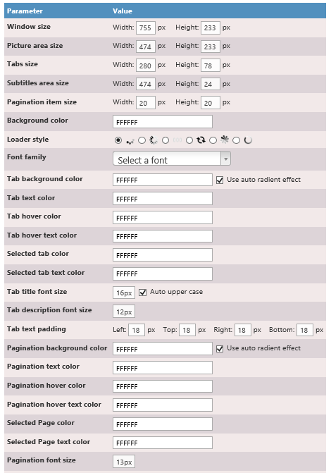
 SimpleCarousel Configuration
About this App
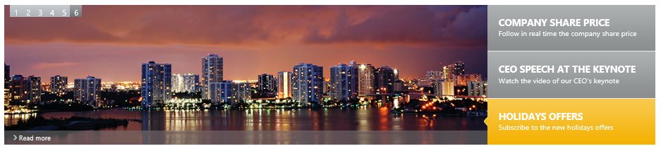
The Carousel News App is client app part to add a dynamic vertical carousel news system in your web site. This news system displays news with image, title, description and caption with a vertical scrolling effect between them. The displayed news links come from two SharePoint lists, one for the text, and another for the pictures.
To add, edit or remove news, you can place page in edit mode and then click configuration.
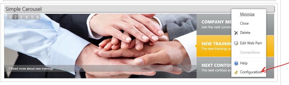 This brings you to these tiles that link to lists for news, images, and layout config

http://[Top-level-site-URL] /Lists/CarouselNews/AllItems.aspx
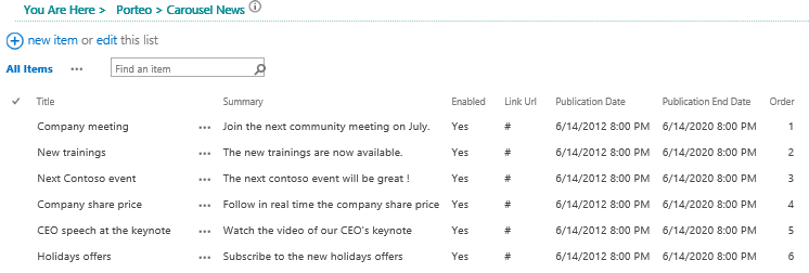
Title |
News title displayed under the news pic. |
Enabled
|
Use this boolean to specify if this news will be display or not. |
Publication Date |
This datetime field indicates when the news will be available. |
Publication End Date
|
This datetime field indicates the deadline for the publication of the news. |
Order |
This integerer field indicates the display order (in ascending order). |
Image URL
|
Use this field to specify the full or relative address of the news picture. If your pictures are in the dedicated picture library, you can use relative address, like "../HorizontalNewsImages/sample.png". |
Link URL |
Use this field to specify the full address of the news article.
|
Link Label |
Use this field to specify the "read more" label. By default, we recommand to use "Read more" for example. |
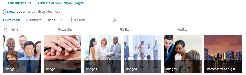
http://[Top-level-site-URL] CarouselNewsImages/Forms/Thumbnails.aspx
Note: no leading / before image name
Suggested image size is 920 x 240 pixels
When you're editing the app properties, you can change the following custom fields:
AutoStart |
General Settings |
Boolean |
Indicates if the transitions between each news will start automatically or not. |
Circular |
General Settings |
Boolean |
Indicates if the transition restarts automatically on the first news after the last one. Default is false. |
Allow Keyboard |
General Settings |
Boolean |
Indicates if the user can use the keyboard arrows to navigate between news. The default value is true. |
Speed |
Effects Settings |
Integer |
Indicates the default speed between each news panel in milliseconds. The default value is 8000. |
Transition |
Effects Settings |
Enum |
Indicates the kind of transitions used between each news. The available values are : |
Panel Fx Speed |
Effects Settings |
Integer |
Indicates the default speed of the transition in milliseconds. The default value is 500. |
Captions Transition |
Effects Settings |
Enum |
Indicates the kind of transitions to display the captions. The available values are: |
Captions Delay |
Effects Settings |
Integer |
Indicates the delay to display the captions after the news, in milliseconds. The default value is 10. |
Captions Transition Duration |
Effects Settings |
Integer |
Indicates if time of a captions transition in milliseconds. The default value is 300. |
Custom CSS File |
General Settings |
String |
Indicates a relative or full address of a custom CSS file to override the app part styles. |